Notes
Geneformer from scratch, part 4: does it capture disease?
This series builds nano-Geneformer, a tiny, from-scratch version of Geneformer. It's small enough to pretrain on a laptop in a few hours, but has every real piece in place: the tokenizer, a BERT-style transformer, masked-gene pretraining, and the classifiers that ask what it learned. We run the whole thing on a real ulcerative-colitis (UC) atlas of 365,492 cells (Smillie et al. 2019).
Five parts:
- A cell is a sentence. Turn raw expression into rank-ordered gene tokens. (part 1)
- Build and train the BERT. The transformer, and masked-gene pretraining. (part 2)
- Does it capture cell types? Read cell identity off the frozen embedding, against a classical baseline. (part 3)
- Does it capture disease? This post. The harder test, and what moves the needle (scale, weight tying, value-aware tokens).
- In-silico perturbation. Delete a gene and watch the model react: gene co-expression, which works, and disease drivers, which don't.
New to single-cell biology or to transformers? The glossary defines the terms from both fields, each with a worked example.
In part 3 the frozen embedding read 51 cell types at ~80% accuracy, right behind PCA, and far above chance. Our nano-Geneformer model captured the strongest signal in the data, i.e. cell identity.
In this post we ask a harder question: can our nano-Geneformer model capture UC disease severity?
We don't expect the model to do well here. But a foundation model should ultimately capture disease, so we measure it anyway. It doesn't do well, and the reason goes back to how we encoded cells in part 1.
The three groups: a severity gradient
The disease labels come from the Smillie atlas's sampling design. Colonic mucosa was profiled by single-cell RNA-seq across two donor groups: 12 healthy controls and 18 patients with ulcerative colitis. From each UC patient, tissue was collected at two sites: one actively inflamed and one non-inflamed (quiescent tissue from the same diseased colon). Each cell carries the disease status of the biopsy it came from, giving three groups, roughly balanced across the 100,000-cell subsample:
- Healthy: from a healthy control donor (30,312 cells)
- Non-inflamed: from a UC patient, but quiet tissue (35,482 cells)
- Inflamed: from a UC patient's actively inflamed tissue (34,206 cells)
The three groups form a severity gradient: healthy → diseased-but-quiet → inflamed. The hardest line to draw is the middle one. A Non-inflamed cell and a Healthy cell can look almost identical.
The same classifier, a harder label
The tool is the same linear classifier from part 3, pointed at a harder question. Nothing about the model changes. We freeze it and never train it further. Only the label changes: instead of the cell's type, the classifier now reads its disease state: Healthy, Non-inflamed, or Inflamed. The same PCA-50 baseline rides along, so we can still ask whether pretraining beat a plain linear summary of the raw counts.
The result
Before we build the classifier, let's just look at the embedding, the same first step we took in part 3. We run a t-SNE of the frozen cell embeddings and colour the same map two ways: left by cell lineage (the 51 cell types grouped into a handful of broad families), right by disease group.
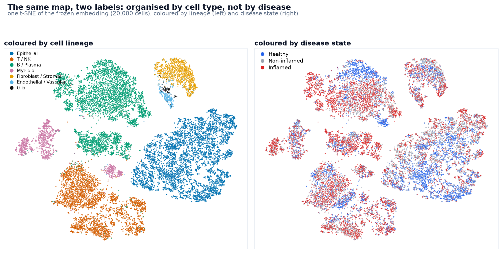
The two colourings look almost the same. On the left, cells of the same type sit together in clear clusters: the embedding sorted cells by identity. On the right, those same clusters are still there; disease just mixes its three groups within each cluster. A cluster of fibroblasts holds healthy, non-inflamed, and inflamed cells together, not split into separate corners. There is some patchy structure (a few spots lean inflamed or healthy, mostly where disease changes which cell types a tissue has), but disease never forms clusters of its own the way cell type does. The map already answers much of the question. The embedding sorts cells by what they are, and disease is only a faint overlay on top.
A t-SNE plot is just a way to visualize whether the disease signal is strong enough to pop out. To measure the effect properly, we build the classifier.
What goes in is one row per cell: its 256-dimensional mean-pooled embedding (the model's per-gene vectors averaged into a single summary vector), paired with the cell's disease label.
The code is a plain logistic regression, fit on the training cells and asked to predict the held-out ones:
from sklearn.linear_model import LogisticRegression

clf = LogisticRegression(max_iter=3000)
# X = 256-d cell embeddings, y = disease group
clf.fit(X[train], y[train])
# one predicted group per held-out cell
pred = clf.predict(X[val])What comes out is a predicted disease group for every validation cell. The split is by patient, not by cell. Of the 30 donors, 6 are held out entirely, so the classifier trains on 24 donors' cells and is graded on the 19,791 cells from patients it never saw (6,298 Healthy, 5,542 Non-inflamed, 7,951 Inflamed). We score those predictions with macro-F1, against a floor: the score you'd get by labelling every cell the single most common group.
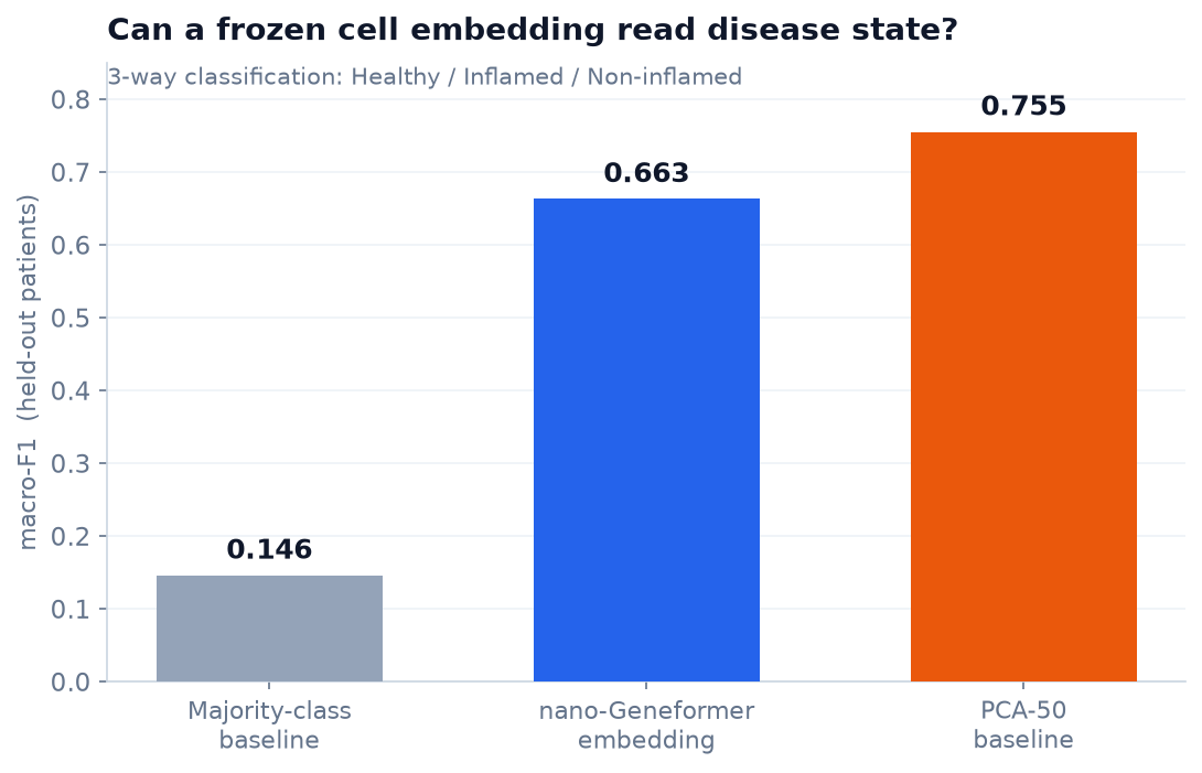
First, the score itself. It's macro-F1, not raw accuracy. For each of the three groups, F1 folds two kinds of mistake into one number: cells of that group the classifier missed, and cells it wrongly labelled as that group. Macro then averages the three groups' F1s with equal weight, so every group counts the same regardless of how many cells it has. Equal weighting matters here. A classifier can't score well just by leaning on the most common group, which would flatter plain accuracy. A high macro-F1 means it separates all three levels of the gradient. It's also the same yardstick we used for cell type in part 3, so the two tasks compare directly.
Now read the three bars left to right. The first is the floor: 0.146, what you'd score by labelling every cell Non-inflamed, the commonest group. Both real representations clear it by a wide margin, so each carries genuine disease signal. But this time the classical baseline wins clearly. The middle bar, the nano-Geneformer embedding, lands at 0.663. The right bar, PCA-50, reaches 0.755, a gap of 0.092 in PCA's favour.
That's one split, and it leans on just six held-out patients. Before we read anything into the exact gap, we should check whether the number survives holding out different patients.
Can we trust one split?
Disease is a patient-level label: every cell from a healthy donor is tagged Healthy, so the real sample size isn't 19,791 cells. It's the handful of held-out patients, and only two of the six were healthy. A number resting on two people is worth double-checking.
So we check it directly. Rotate the held-out set across all 30 patients (five folds, split by patient so no one's cells cross the line), refit the same classifier each time, and watch how much the score moves:
| one split (embed / PCA) | across 5 patient folds (embed / PCA) | |
|---|---|---|
| disease | 0.663 / 0.755 | 0.51 ± 0.11 / 0.56 ± 0.12 |
| cell type | 0.629 / 0.678 | 0.65 ± 0.02 / 0.69 ± 0.02 |
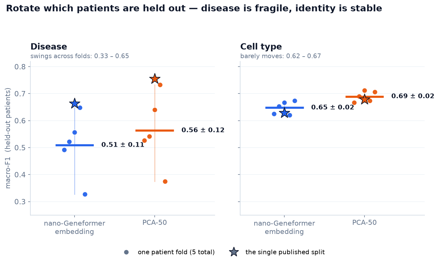
The disease number is shaky; the cell-type number isn't. Depending on which patients you hold out, the embedding's disease macro-F1 swings from 0.33 to 0.65. It nearly doubles. The published 0.663 sits at the top of that range, and the honest average is about 0.51. Cell type barely moves (±0.02). The patient-level label is the cause. Disease is graded on a few people per group, and the worst fold held out a single healthy patient, so the score rides on which people you happened to draw. Cell type is graded on thousands of cells spanning every type in every fold, so it stays put.
But the direction is rock-solid. In all five folds, for both tasks, PCA beats the embedding: the paired gap is always positive (disease +0.05 ± 0.03, cell type +0.04 ± 0.01). So "a plain PCA baseline beats the pretrained embedding" is not a fluke of one split; it holds however we cut the patients. The small numbers won't support a precise gap, though. The embedding is a little behind PCA on both tasks, slightly more so on disease. And the near-twofold difference between the tasks that the single split implied (disease 0.09 vs cell-type 0.05) shrinks to almost nothing across folds (disease 0.05 vs cell-type 0.04).
Our explanation: PCA keeps magnitude
We don't think this is a bug or too little training. Our best explanation goes back to how we encoded cells in part 1: rank encoding keeps which genes are high and throws away how high. This is a hypothesis. We didn't isolate it by swapping the encoding and re-measuring, but it's the reading most consistent with what we saw, and the next two sections lay out the evidence.
This is fine for identity. A cell's type is set by which programs it runs, and part 3 showed the embedding reads that well. But disease state is different. An inflamed fibroblast and a resting one are the same cell type running the same program. The inflamed one just runs it harder, with more collagen and chemokine transcripts. The difference between Healthy and Inflamed is mostly magnitude: how far a program is turned up.
Ranking throws that magnitude away. PCA, computed on the log-normalized counts, keeps it. So on the one axis where severity is a matter of degree, PCA has signal the model doesn't. This matches the map. Inflamed and healthy cells sit in the same clusters because ranking kept the identity they share and dropped the one thing that separates them: how hard those shared programs run.
Is it the toy, or the encoding?
The obvious objection: the model is tiny (4.5M parameters, trained briefly on a laptop), so of course it loses. That's partly right. The scaling test in the next section shows that more data does close some of the gap. And a model this small says nothing about the field. This is a result about our own model, not a general claim.
The two tasks still behave differently, though. If the problem were only size, it would hold back both of them equally. Instead, the embedding already measures identity reliably, and scaling lifts it past the PCA baseline (next section), while disease stays behind however we slice the patients. Parameter count doesn't explain that difference. Disease depends on the magnitude the rank encoding throws away, and cell type doesn't. We can always add size; the encoding is the deeper problem.
This question (whether pretrained models beat classical baselines) is unsettled even at full scale. A 2024 benchmark, "one PCA still rules them all" (Bendidi et al., NeurIPS 2024 AIDrugX Workshop), found "scVI and PCA to be far better suited… in comparison to existing foundation models" on a perturbation task. That's an independent result on real models, not evidence our toy generalizes, but it shows that beating a strong classical baseline, not just chance, is a bar the field is still working to clear.
What moves the needle?
If the model is losing because magnitude is missing, the fixes to try are the ones that put magnitude back, or give the model more room to use what it has. There are three. We ran the first two and can show real numbers. The third is beyond what a model this small can reach.
1. More data, more training. The published model above saw only a 100k-cell subsample, trained for two epochs. The obvious thing to try is more of both: the full atlas (358k cells after QC) for five epochs, same tiny architecture, nothing else changed.
This is a real pretraining run, not a quick classifier fit. We use a standalone script, train_stage.py, pointed at the fully prepared dataset:
python train_stage.py --data data_365k --epochs 5 --max-len 320It pretrains on the 287,775 cells from the 24 training patients (masked-gene prediction, exactly as in part 2) while the same 6 patients stay held out for scoring. On an Apple-Silicon laptop (MPS) it ran for about 4.4 hours: five epochs of 4,496 steps each, driving the pretraining loss from 7.7 down to 3.06. (The shorter sequence length here, 320 ranked genes per cell instead of 1024, is a memory-fit choice for this hardware. It covers about 99% of each cell's genes and reproduces the 100k model's classifier scores exactly, so it doesn't skew the comparison.)
The bigger, better-trained model moved both classifiers:
| representation | disease macro-F1 | cell-type accuracy |
|---|---|---|
| PCA-50 baseline | 0.762 | 0.828 |
| 100k / 2 epochs (the model above) | 0.663 | 0.799 |
| full atlas / 5 epochs | 0.709 | 0.837 |
(The PCA-50 and full-atlas rows are scored on the full atlas's held-out patients, 70,528 cells from the same 6 donors, so the PCA numbers shift a little from the 100k figures in the headline above and in part 3: disease 0.755 → 0.762, cell type 0.823 → 0.828. The 100k row keeps its original measurement on its own 19,791-cell validation set.)
On disease, the embedding climbed 0.663 → 0.709, a real improvement, though PCA (0.762) still leads (a single-split estimate; we didn't cross-validate the disease task at this scale). On cell type, scaling flipped the result, and here we did run the same patient-level check: where the 100k model lost to PCA in every fold, the 365k model now beats PCA on macro-F1 in all five folds (0.720 vs 0.703, gap +0.017 ± 0.009). On raw accuracy the edge is slimmer: the embedding wins four of five folds (+0.007), essentially a tie. But on the imbalance-robust score the flip is clean. So scale helps both tasks, but not equally. Identity, which ranking keeps, moves past the baseline. Magnitude, which ranking discards, improves and stays behind.
2. Weight tying. Part 2 noted our gene embeddings didn't organize: COL1A1's nearest neighbors were a grab-bag, not other collagens. Weight tying is the standard fix: it ties the input gene embeddings to the output layer, and part 2 explains how. Applied to the full-atlas model, it does sharpen the gene embedding: COL1A1 now sits next to fibroblast and collagen genes like PDGFRA and COL14A1, and the similarities roughly double. But it doesn't move the cell-level classifiers at all (disease 0.705, cell type 0.839, unchanged). It cleans up how genes relate to each other without changing what a cell looks like to the classifier.
3. Put the magnitude back: value-aware tokens. Neither of the first two closed the disease gap, for the same reason: magnitude never entered the input in the first place. The fix is to stop throwing it away. Pair each gene token with a binned expression value, the way scGPT does, so the model sees both which gene and how loud. That targets the exact axis PCA keeps winning on. It's a real architecture change, not a dial to turn: a second embedding table and a reworked tokenizer. This is where "nano-Geneformer" would grow into a proper value-aware model.
What we tested, and what the whole series showed
Across four parts we took a cell from a bag of 20,000 gene counts all the way to a pretrained transformer, then asked the plain question: what is this representation actually good for? We got two answers:
- It captures identity. Frozen and unsupervised, the embedding reads 51 cell types about as well as PCA (a touch better once scaled, in every patient fold), and the score barely moves whichever patients you hold out. Ranking keeps which genes are on, and that's most of what a cell type is.
- It struggles with state. On disease severity it loses to a plain PCA baseline in every patient fold, because rank encoding discards the magnitude that inflammation is written in, and the score is both lower and far noisier to pin down. More data narrows the gap without closing it.
A pretraining loss going down tells you the model learned structure. Only a classifier tells you which structure, and against what baseline. For our rank-based model the structure is identity, the baseline to beat is a classical one, and the missing ingredient is magnitude. Value-aware models put that back in.